
Price shows you direction. However, it hides speed. A market can climb twenty points in two days or in two months, and the chart line looks similar at first glance. Momentum tools close that gap. Among them, the RSI indicator remains the most widely used, and for good reason.
Over two decades of chart work, I have watched thousands of traders reach for this tool on day one. Most of them misread it. They treat a single number as an instruction to buy or sell. In practice, though, the RSI indicator measures pressure rather than permission. Once you understand that difference, your reading improves quickly.
This guide walks through the mechanics, the zones, and the practical habits that separate careful analysis from guesswork.
What Is the RSI Indicator?
So, what is the RSI indicator in plain terms? It is a momentum oscillator that compares recent gains against recent losses and reports the result on a scale from 0 to 100.
J. Welles Wilder Jr. introduced the tool in 1978 in his book New Concepts in Technical Trading Systems. He named it the relative strength index. That name causes confusion, because the tool does not compare one asset with another. Instead, it compares an asset with its own recent behaviour.
The reading sits in a separate panel below your price chart. Furthermore, the line moves faster than price itself, because it responds to the size of each candle rather than its position. Consequently, traders often spot a loss of momentum on the oscillator before they see it in the trend.
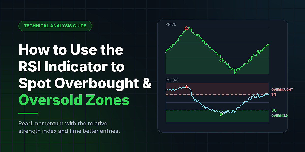
Two horizontal levels usually appear on that panel. The upper level sits at 70, and the lower level sits at 30. Those two lines mark the overbought and oversold zones, and they form the backbone of everything that follows.
How the RSI Indicator Works
Understanding how the RSI indicator works removes most of the mystery. The calculation runs in three simple stages.
First, the tool measures the change between each closing price and the one before it. Next, it separates those changes into gains and losses, and it averages each group over a set number of periods. The default period is 14.
Finally, it divides the average gain by the average loss. That figure is the relative strength. The formula then converts it into a bounded number between 0 and 100.
Because of that structure, the reading behaves in a predictable way. When average gains dominate, the line rises toward 100. When average losses dominate, the line falls toward 0. When gains and losses balance out, the line settles near 50.
Therefore, the midpoint carries real meaning. A reading above 50 tells you that buyers have controlled recent sessions. A reading below 50 tells you that sellers have. Many experienced traders watch that midline as closely as they watch the extremes.
Understanding the Overbought Zone
A reading above 70 places the market in the overbought zone. The label sounds dramatic, so let me be precise about it.
Overbought does not mean expensive. It does not mean the top has arrived either. It simply means that buying pressure has been unusually strong and unusually one-sided over the measured period. In short, the move has become stretched.
Two outcomes follow from that condition. Sometimes buyers exhaust themselves, and price pulls back or drifts sideways while momentum cools. Alternatively, fresh buyers keep stepping in, and the trend continues while the oscillator stays high for weeks.
That second outcome surprises newer traders. During powerful uptrends, the relative strength index can hold above 70 for an extended stretch. Anyone who shorts the first touch of that line often absorbs a painful loss. As a result, seasoned analysts treat an overbought reading as a reason to tighten risk rather than a reason to reverse position.
Understanding the Oversold Zone
A reading below 30 places the market in the oversold zone. The same logic applies in reverse.
Selling pressure has dominated, and the decline has become stretched. Bounces often follow, because short sellers take profits and buyers hunt for value. However, a deep downtrend can pin the reading under 30 for a long time.
I have seen this pattern repeat in falling markets year after year. Traders buy the first oversold print, then average down as price keeps sliding. Meanwhile, momentum stays weak because nothing has actually changed in the trend.
For that reason, an oversold reading works best as an alert rather than an entry. It tells you where to start paying attention. Price then has to confirm the idea.
Why 70 and 30 Are Not Automatic Signals
This point deserves its own section, because it causes more losses than any other misunderstanding.
The RSI indicator describes what has already happened. It does not forecast what happens next. A high number reflects strength, and strength often persists. Likewise, a low number reflects weakness, and weakness often persists too.
Consider a simple example. A stock breaks out on strong earnings and the reading jumps to 78. That figure reveals genuine demand. Selling into it means betting against the very force that just proved itself. Sometimes that bet works, yet the odds rarely favour it.
Context solves the problem. Before you act on any zone reading, ask three questions. What is the larger trend doing? Where does price sit relative to support and resistance? Has momentum actually started to turn, or has it simply reached a level?
Using RSI in Trading: Four Practical Methods
Once the theory settles, the next step is application. Using RSI in trading effectively comes down to a handful of repeatable habits.
1. Wait for Price to Confirm the Reading
Momentum alerts you, but price confirms. Consequently, patience adds more value here than any setting change.
Suppose the oscillator drops to 24 during a pullback within an uptrend. Rather than buying immediately, wait for structure. A bullish engulfing candle, a break above the prior session's high, or a clean hold at support all provide that confirmation. In addition, many traders wait for the line itself to cross back above 30 before they commit.
2. Watch for Divergence
Divergence remains the most reliable pattern the tool produces. It appears when price and momentum disagree.
Bearish divergence forms when price prints a higher high while the oscillator prints a lower high. That gap suggests the rally is running on thinner fuel. Bullish divergence forms when price prints a lower low while the oscillator prints a higher low, which hints that selling is losing force.
Divergence often develops before a visible trend change. Nevertheless, it can persist for several sessions without resolving. Treat it as early warning, and combine it with a break of trend structure.
3. Adjust the Levels to the Trend
Fixed levels suit ranging markets well. Trending markets need flexibility, though.
In a strong uptrend, shift your reference points to 80 and 40. Pullbacks in such trends rarely reach 30, so waiting for that number keeps you on the sidelines. In a strong downtrend, use 60 and 20 instead. Rallies fade before they reach the traditional overbought line.
This single adjustment improves results more than almost any other tweak.
4. Check a Higher Timeframe
A reading of 28 on a five-minute chart means very little if the daily chart shows a healthy uptrend. Therefore, always check at least one timeframe above the one you trade.
When both timeframes point the same way, the signal carries far more weight. When they conflict, the higher timeframe usually wins.
Pairing the Reading With Support and Resistance
Momentum gains real power when you overlay it on structure. Levels give the reading a reason to matter.
Picture a market that has bounced three times from the same price area. Buyers clearly defend that zone. Now the market returns to it, and the RSI indicator prints 26. Two independent pieces of evidence now agree, so the setup carries weight.
Compare that with an oversold print in the middle of open space. Nothing supports price there, and nothing stops the slide. The reading looks identical on the panel, yet the trade quality differs enormously — because price levels are rarely random; they often mark where real economics and trade activity previously clashed between buyers and sellers.
The same principle applies to resistance. An overbought reading directly beneath a well-tested ceiling deserves attention. Sellers already showed up at that price once, and momentum now suggests buyers have stretched themselves.
Mark your levels before you open the oscillator, therefore. That order matters, because it stops you from drawing lines that simply justify the signal you already want to see, rather than lines grounded in the actual economics and trade behavior visible on the chart.
Choosing the Right Settings
The 14-period default has survived for decades because it balances sensitivity and stability. Still, small adjustments suit different styles.
Shorter settings, such as 7 or 9 periods, make the RSI indicator react faster and reach the extremes more often. Active intraday traders sometimes prefer that responsiveness, although it produces more false alerts. Longer settings, such as 21 or 25 periods, smooth the line and suit position traders who want fewer, cleaner readings.
My advice after years of testing is simple. Pick one setting, then learn how it behaves across many market conditions. Constant tinkering destroys the pattern recognition you need most.
Common Mistakes to Avoid
Several errors show up again and again, so watch for them in your own process.
Trading every touch of 70 or 30 tops the list. Extremes on the RSI indicator appear far more often than reversals do. Ignoring the trend ranks second, because counter-trend entries based on one number carry poor odds.
Stacking similar tools creates a third problem. Adding three momentum oscillators to one chart does not triple your evidence, since they all measure roughly the same thing. Instead, pair the RSI indicator with something different, such as volume or moving averages.
Finally, skipping the stop-loss undermines everything else. Even a well-timed entry fails sometimes. Position sizing and risk limits protect the account while you wait for the good setups.
Building a Repeatable Process
Strong analysis comes from routine, not from single indicators. Start with the trend on a higher timeframe. Then mark your key support and resistance levels. Only after that step should you check momentum.
When an extreme reading lines up with a meaningful level and a confirming candle, you have a genuine setup. When it appears alone, you have information and nothing more. That distinction defines disciplined trading.
Used this way, the RSI indicator becomes a lens rather than a crystal ball. It shows you where pressure has built up, and it warns you when a trend starts to tire. Over hundreds of trades, that edge compounds.
Keep a journal of every momentum-based entry you take. Record the reading, the trend, the confirmation, and the outcome. After fifty trades, patterns emerge that no tutorial can teach you. At GainzAlgo, we believe that kind of structured review turns a familiar tool into a durable skill, because consistency beats complexity in every market.